
Twelve candidates, one voice
Choose the Front Page
Every design below carries the same content, navigation and catalog — only the mood changes. Open any of them full-screen; the floating ✦ button lets you flip between designs from anywhere.
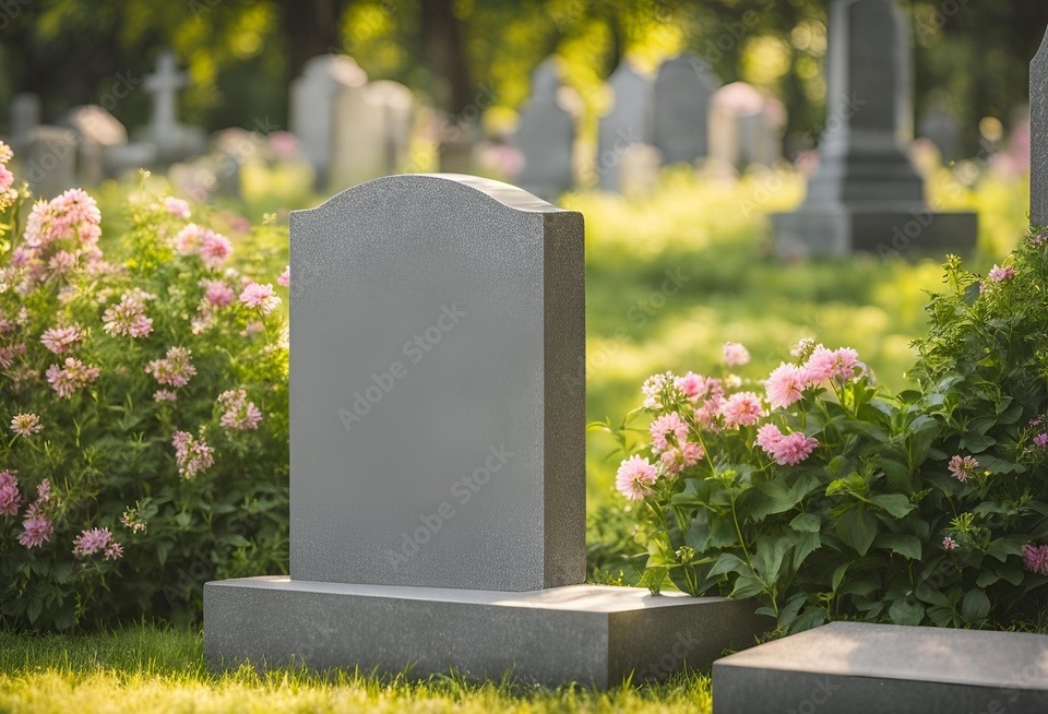 № 01
№ 01Serenity
The flagship. A garden hero in slow Ken Burns motion melts into ivory; Roman inscription capitals, bronze details, arch-framed categories.
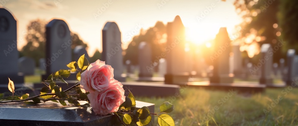 № 02
№ 02Vigil
Dusk and candlelight. A sunset pans slowly over black granite; gilded Cinzel capitals on deep spruce night.
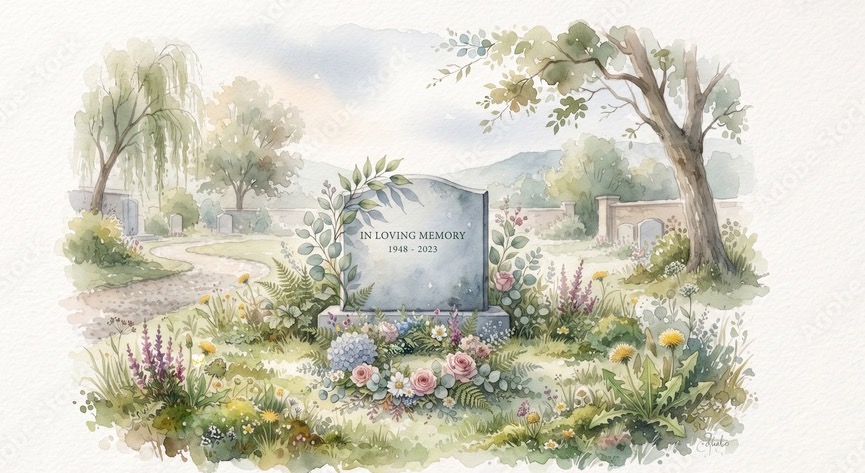 № 03
№ 03Aquarelle
The painted page. A watercolor feathers into warm paper; wavy dividers, sage and rose, hand-drawn underline.
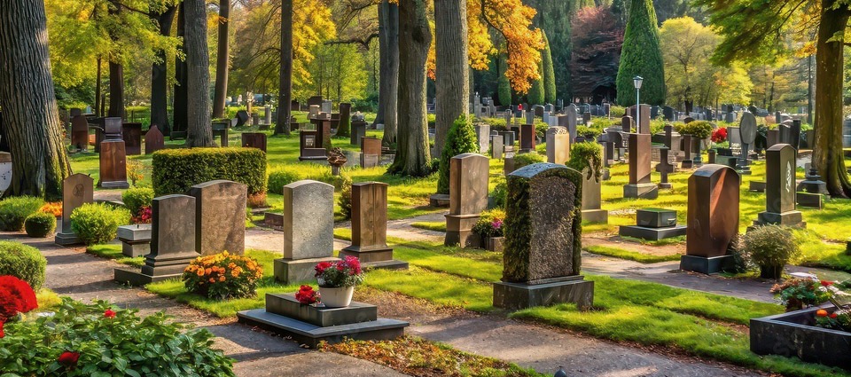 № 04
№ 04Harvest
Brooklyn autumn. A split hero with a warm cream panel and glowing fall trees; a browsing rail of categories.
 № 05
№ 05Stillness
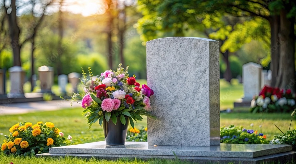
Near-white minimalism over a full-width image veiled in white; hairline rules, a category list that breathes. Blush accent only.
 № 06
№ 06Evergreen
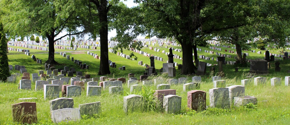
Deep park green. A duotone meadow under gold-leaf capitals, closing in layered waves.
 № 07
№ 07Meadowlight
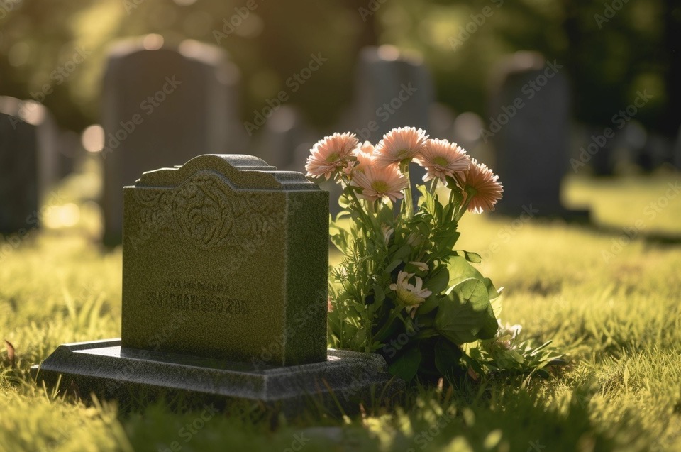
Golden hour, held in a drawn arch. Parallax morning light; Spectral serenity.
 № 08
№ 08Courtyard
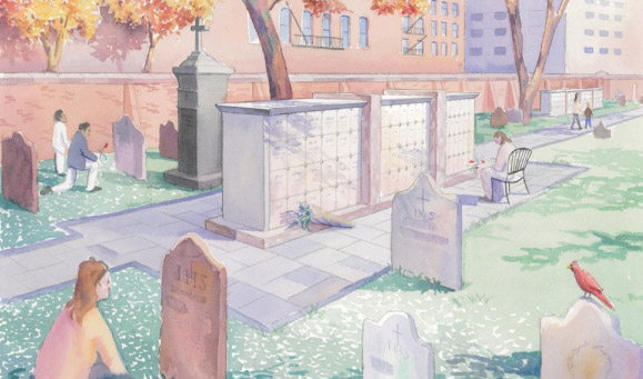
The Brooklyn folio. A framed watercolor, editorial plates, a drop cap, and one cardinal-red accent.
 № 09
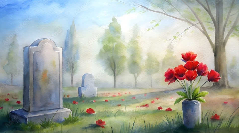
№ 09Poppies
Fog and bloom. A watercolor sky dissolves into the page; poppy-red heartbeats of color.
 № 11
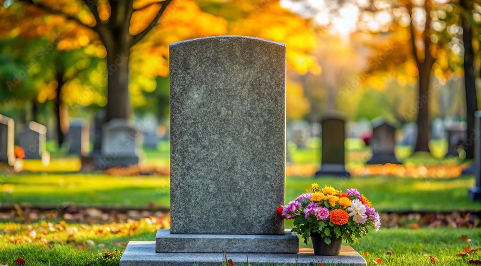
№ 11Almanac
Harvest, condensed to an almanac: all 72 designs on one page as compact stone-thumbnail rows, with one-tap filters and deep links. Built for fewer clicks.
№ 14Lineup
The lineup, Apple-style under the amber hero: pick a form in the Monuments strip and its cards appear — with granite dots that recolor every stone in place.
№ 15Autumn Lineup
The same lineup beneath Harvest’s bright autumn trees — full-width hero, wave transition, and granite dots on every card.